
We’ve been busy working on a slew of new features to make 6Q even more useful, and we’re excited to announce that two of these features have now been made live to everyone.
Since we launched 6Q, we have been careful to balance the ability to add lots of features with the power of our simplicity; an element that has won over many of our customers. Whilst we feel our reports need to be as simple as possible to interpret, we also know that we can add more detail in these, without sacrificing this aim.
We have just pushed live a few changes to the way your poll reports are displayed. I believe these make 6Q even more valuable, and the reports far easier to interpret by managers, quickly.
Introducing Assessments
Our customers run polls, collect great data and then sometimes aren’t in a position to know what they should action next. To combat this, we’ve introduced our automated Assessments panel to our reports. These short assessments looks at the data we have just collected, compares it against previous polls and our global benchmarks and gives you a few comments.
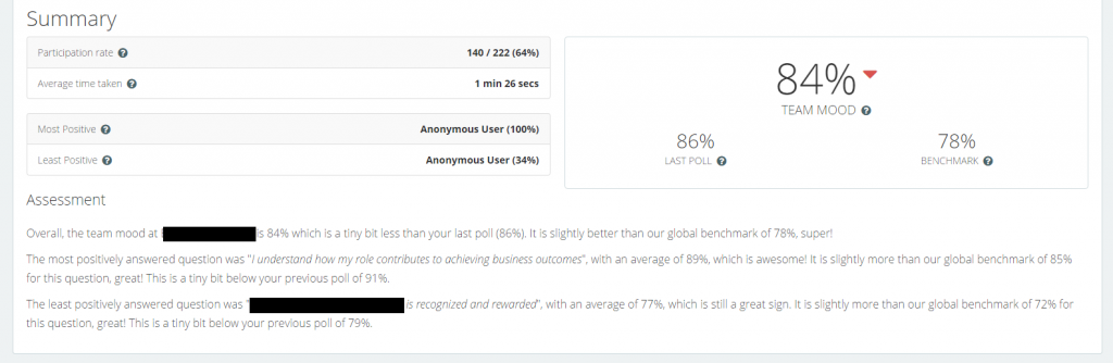
New assessment screen
The medium term plan is to make this assessment something that gives you far greater granular suggestions on team mood and your various question responses. We have decided to launch this smaller version of our greater plan now, to give customers a sense of what is in store for the future.
Improved Poll Reports
For those who have a strong statistical science bent, you would have noticed that we have always focused purely on the mean average of responses, to create our scores. We are pleased to introduce a few new averages and statistics for you in our employee reports, which are;
The “mean” is the average that you’re used to, where you add up all the responses and then divide by the number of responses.

The “median” is the ‘average’ taken by sorting all responses into low to high, and then displaying the very middle response. In the event that your total responses are an even number, we get the two closest to the middle responses, and work the average out between them.
The “mode” is the value that occurs most often. If no percentage is repeated, then there is no mode for the list.
The “range” is just the difference between the least and most positive responses.
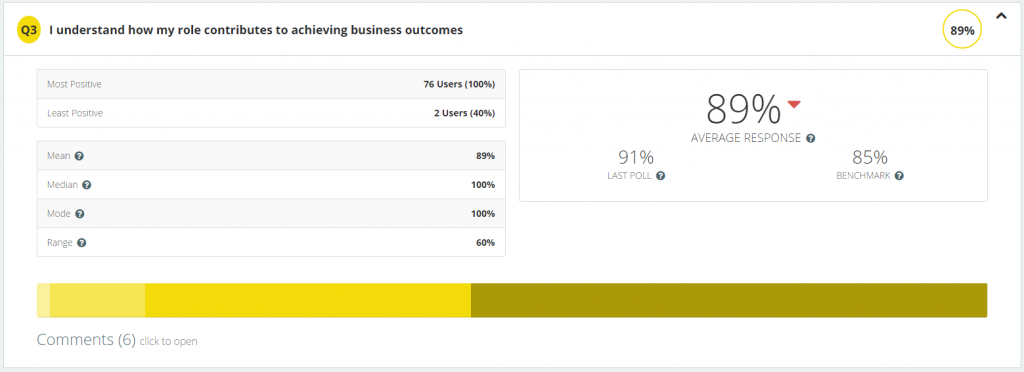
New responses screen
The above image shows how these new employee statistics work, overall. Whilst we still use mean averages as the most important figure, because we feel it makes most sense.
Our next main change is our far easier to understand response spread graph, showing you the ranges in which most responses are received. The previous spread graph was found to be confusing by some customers, and so we have overhauled how this looks, to make interpreting cohorts of responses that your poll collects far easier to interpret.
If you hover over a colour within this new graph, it will display the range, and the total amount of repsondees who answered this way.
The focus for managers is to try and reduce the width of the very left cohort (the least positive) and increase the width of the very right colour (the most positive). You can see in the example image above, that this answer was very favourably answered.
The third change is specifically designed for our larger enterprise customers. Whilst the reports are fine with a dozen or less segments and 100 or less employees leaving text comments, the length of the report can become overwhelming when we factor this into the thousands of employees or comments.
We haven’t removed any of the data, we have just made it easier to review an overall report, before digging down further into responses and segments.
The comments are now shown as a total of comments (6 comments in the above example image), and there is now a ‘click to open’ link, which when clicked, will reveal each individual comment.
By doing this, we believe we have improved the speed in which a manager can review a report, and the load time of larger reports has been greatly reduced.
In Summary
As I stated at the start of this article, we believe these changes make interpreting your employee reports even easier than below, whilst still providing additional very useful information. We are constantly focused on keeping our tool as simple as possible to use, however as powerful as possible with the data we collect; we trust you also feel we have the balance right with these updates.
We are very keen to hear from our customers what they think of these new features, and if they find them useful. We look forward to hearing your thoughts.